2023
Design Systems, Data Visualization
Clarity through structure, minimal ornament, high contrast
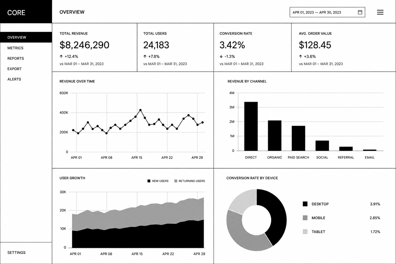
A data-heavy organization needed a visualization system that could present complex information without adding visual complexity. Existing chart libraries offered decorative bells and whistles that distracted from the data itself. They needed clarity through structure.
We developed a data visualization system built on brutalist principles. Charts use stark grids, minimal color (black, white, and one accent), and no decorative flourishes. Axes are clearly labeled. Data is presented without embellishment. The system scales from simple line charts to complex dashboards while maintaining visual clarity.
A visualization system where data takes center stage. The stark, structured approach makes patterns immediately apparent. Users focus on insights rather than visual design. The system is maintainable and scalable, ensuring consistency across all data presentations.