2024
Product Design, Interface Design
Content prioritization, stark navigation, clarity-first
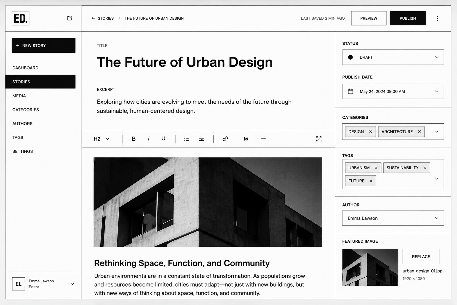
An editorial team needed a publishing platform that could handle complex content hierarchies while maintaining a straightforward, no-nonsense interface. The existing system was cluttered with unnecessary features and visual noise that distracted from content creation and publication.
We redesigned the platform around a brutalist philosophy: every interface element serves content publication. Navigation is stark and direct. Visual hierarchy relies on black, white, and carefully positioned borders. No gradients, no shadows, no unnecessary decoration—only what facilitates the editorial workflow.
A publishing platform that respects content first. Editors can focus on writing without visual distraction. The structured interface ensures consistency across publications and reduces errors through clear affordances.